
UCLA Health Brand
Logos
UCLA Health uses a multitier logo system to identify all hospitals, clinics, departments, and programs. Department logos integrate the UCLA Health logo with the specialty or department name, which appears below or to the right of the logo.
Primary Logo
Our logo comes in horizontal and stacked versions. Use the horizontal version whenever possible, and the stacked version for vertical or tight spaces. It’s also available in all-white and all-black. See the full guidelines for approved color variations.


Primary Logo with Tagline
We also offer a logo lockup that includes our brand mission. Use this version when you want to feature the tagline, ensuring it remains clear and legible in your layout.

Owned Entities
The UCLA Health identity program uses a multitier logo system to identify all entities within the UCLA Health brand. This includes all hospitals, clinics, departments and programs.

Primary
These colors are your core brand identifiers. They are used the most. They ground the brand and create visual breathing room across all touchpoints.
UCLA Blue
Headlines

CMYK 83 40 3 6
RGB 39 116 174
HEX #2774AE
PANTONE 2383C
PANTONE 3553U
Midnight at Joshua Tree
Headlines, Subheads, Body Copy, Tagline

CMYK 100 48 12 58
RGB 0 59 92
HEX #003B5C
PANTONE 302C
PANTONE 2955U
Sand
Advertising, Website, Collateral Backgrounds

CMYK 6 6 10 2
RGB 239 237 229
HEX #EFEDE5
PANTONE Warm Gray 1C
PANTONE Warm Gray 1U
Sunmark Yellow
Sunmark Device

CMYK 2 4 30 0
RGB 250 237 189
HEX #FAEDBD
PANTONE 7499C
PANTONE 7499U
Black
The word “Health” in the primary logo

CMYK 0 0 0 100
RGB 0 0 0
HEX #000000
White
Website, Backgrounds, Reversed Logo, Reversed Text
CMYK 0 0 0 0
RGB 255 255 255
HEX #FFFFFF
Secondary
These colors are used sparingly to highlight key moments, organize information and introduce variation across touchpoints.
Malibu Dolphin
Divider Lines, Text

CMYK 6 0 0 70
RGB 101 108 113
HEX #656C71
Chumash Soil
Buttons

CMYK 0 19 89 0
RGB 255 199 44
HEX #FFC72C
PANTONE 123C
PANTONE 115U
Santa Barbara Sand
Web Backgrounds, Collateral Backgrounds

CMYK 2 2 5 0
RGB 246 244 238
HEX #F6F4EE
Silver Screen
Dividers, Rules

CMYK 3 0 0 20
RGB 201 207 212
HEX #C9CFD4
Grove Fountain
Backgrounds

CMYK 20 6 0 0
RGB 218 235 254
HEX #DAEBFE
PANTONE 2707C
PANTONE 2707U
Santa Monica Sunset
Buttons, CTAs

CMYK 0 31 98 0
RGB 255 184 28
HEX #FFB81C
PANTONE 1235C
PANTONE 121U
To meet AA compliance, the contrast ratio must be:
- 4.5:1 for normal text
- 3:1 for large text
To meet AAA compliance, the contrast ratio must be:
- 7:1 for normal text
- 4.5:1 for large text
Normal text is defined as:
- 12 pt (print)
- 16 px (digital)
Large text is defined as:
- 14 pt bold (print)
- 18 px bold (digital)
Extra Large text is defined as:
- 18 pt (print)
- 24 px (digital)
Typography
Our curated set of fonts supports a range of executions, from bold, attention-grabbing headlines to clean, highly legible body copy. Primary typefaces establish consistency and recognition, while secondary fonts offer flexibility for digital interfaces, campaigns, and editorial layouts.
Fonts & Usage
Balboa Medium
Ideal for headlines, bold messaging, billboards, TV supers and standalone brand moments.

Trade Gothic Next Pro Family
Default choice for body copy and longer text, including captions, callouts and articles.

P22 Mackinac Pro Family
Use alongside or in place of Trade Gothic Next Pro for body copy, subheads and labels, offering a slightly different tone or style.

Helvetica Neue Family*
A digital-friendly alternative to Trade Gothic.

Headline Color Usage
Headlines must use a combination of dark blue and light blue. Lead with dark blue for the first 1–3 words to establish emphasis, then transition to light blue for the remaining text. For longer headlines, increase the proportion of light blue to maintain visual balance and readability.
Subheads
P22 Mackinac Pro Family
Trade Gothic Next Pro Family

Labels and Callouts
Trade Gothic Next Pro Family


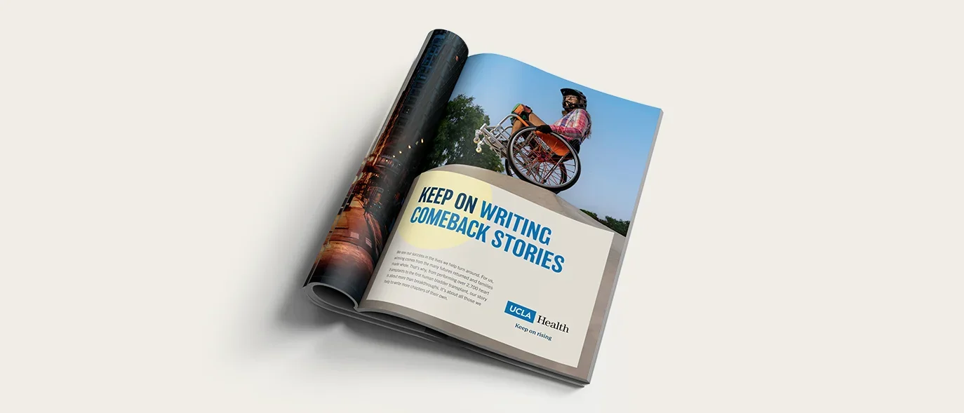
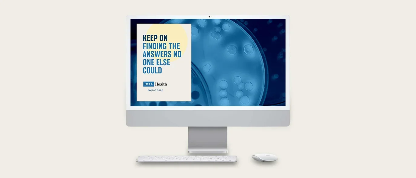
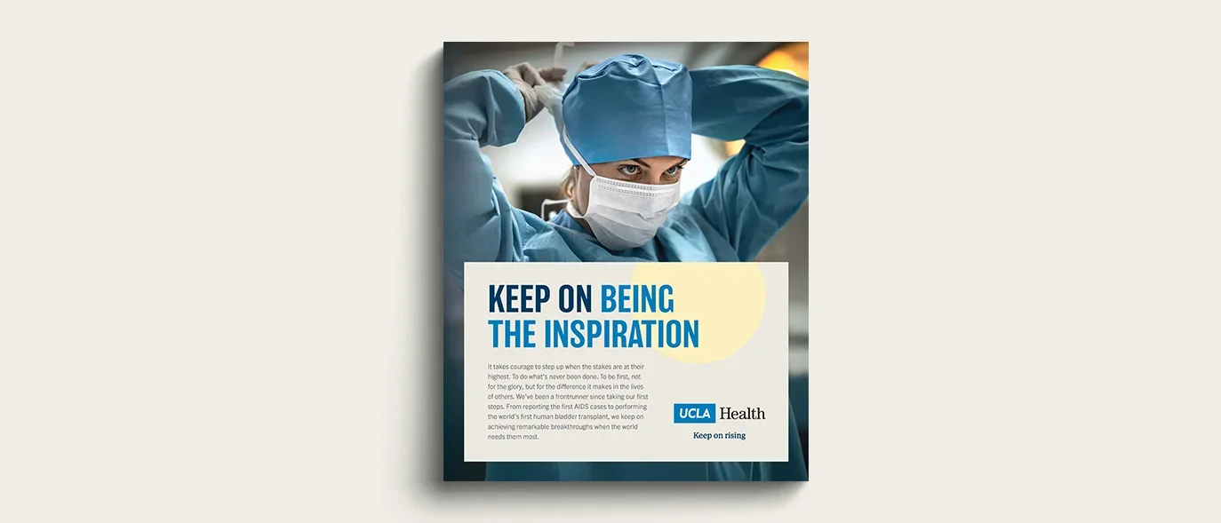
Graphic Devices
The Sunmark
The Sunmark is unique to UCLA Health. It represents the California sun and supports the campaign theme of Keep On Rising.
The Card
The Card graphic device serves as the primary component for presenting messaging, the sunmark and UCLA Health branding over photography.

Card with Sunmark Examples
See creative examples below to see the Sunmark and Card graphic elements in action.


Writing Guidelines
Voice
Our voice balances expertise with approachability, creating a meaningful connection with every audience. We communicate breakthrough ideas in ways that are clear, relevant and grounded in everyday experience — sparking curiosity and trust.
Tone
Our tone is genuine, heartfelt and inspiring: conversational but not casual, informative without being academic. While it may flex by audience, it always stays consistent with our KEEP ON RISING ethos.
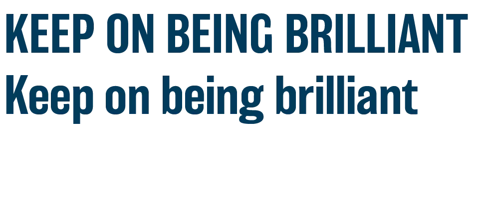
Headlines
There are two headline styles: "Keep On" headlines and traditional headlines.
Keep On Headlines
Select a KEEP ON headline from the approved list. Do not create new KEEP ON headlines. If you need a variation to fit your content, contact the Marketing Department.
- Keep On Finding the Answers No One Else Could
- Keep On Making Second Chances Our First Priority
- Keep On Changing Lives for the Better
- Keep On Being the Inspiration
- Keep On Setting the Standard
- Keep On Writing Comeback Stories
- Keep On Turning Setbacks into Starting Points
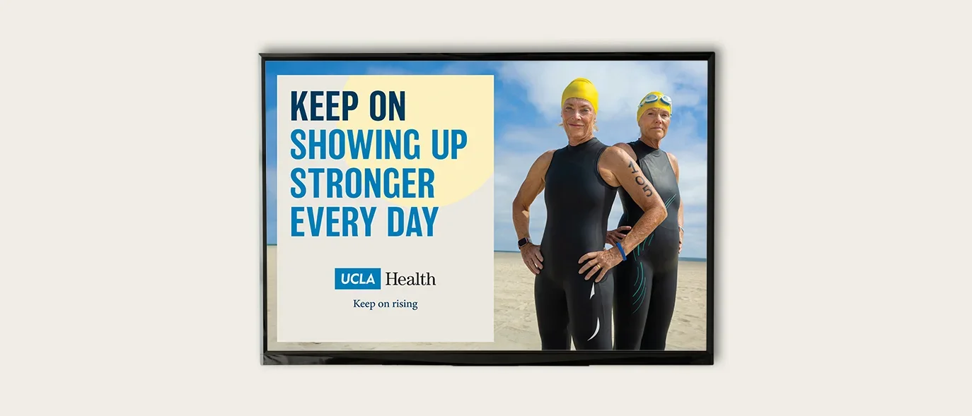
Keep On Showing Up Stronger Every Day
Keep On Overcoming Every Challenge
Keep On Believing It's Possible
Keep On Answering Impossible Questions
Keep On Being The Catalyst That Drives Science
Keep On Discovering Like Lives Depend On It
Traditional Headlines
Use traditional headlines to clearly communicate the core message. Write them specifically for the subject matter, ensuring they reflect the brand voice.
Headline Punctuation
No periods. Even when a headline contains a comma, avoid adding a period. If a headline is two sentences and the first part necessitates a period, add a period after the second sentence as well.
Subheading Punctuation
No periods. Even when a subheading contains a comma, avoid adding a period.
Tagline Punctuation
No period.

Writing Style Guide
Full Writing Style GuidePhotography
Clinical
Use journalistic-style images of clinicians that feel candid rather than staged. Maintain thoughtful composition, with cooler tones, especially blues, to support a clinical setting.
Images are for stylistic reference only.
Rights clearance is required before use.

Patients
Use authentic, candid moments that reflect patient experiences, outcomes, interactions with caregivers or meaningful personal moments within the hospital setting.
Images are for stylistic reference only.
Rights clearance is required before use.

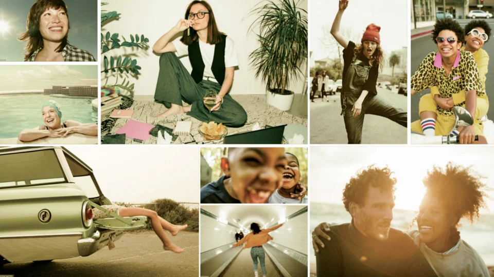
Lifestyle
Use documentary-style images with warmer tones, favoring yellows and oranges. Show people engaged in natural activities; if subjects face the camera, moments should feel spontaneous and genuine.
Images are for stylistic reference only.
Rights clearance is required before use.
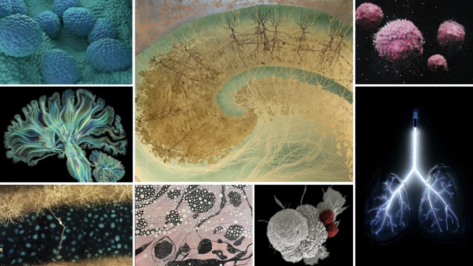
Research & Discovery
Use images that are both scientific and visually compelling, while remaining medically accurate. Artistic renderings (such as brain, nervous system, cells) are acceptable if anatomically correct.
Images are for stylistic reference only.
Rights clearance is required before use.
The UCLA Health Image Library
The Image Library is designed to support UCLA Health branding by making it easy for our professionals to find and use photos and graphics that help to tell the UCLA story. Our emphasis is on quality images that capture UCLA Health’s distinct personality.
Access to downloading images on this site is limited to the UCLA Health Marketing Department. However, you may browse images. If you would like to request a specific photo, please select the image you wish to use, and submit the download request form for that image.